Meet PickleChick
CONCEPT & BRAND DESIGN • NAMING • LOGO

THE CLIENT: PickleChick is a women’s pickleball lifestyle brand created for players who bring as much personality to the court as they do their game. Blending sport, style, and community, the brand celebrates the social side of pickleball with a colorful, playful identity designed to stand out in an increasingly crowded category.
THE ASK: Develop a distinctive brand identity and launch campaign that would introduce PickleChick to a growing audience of female pickleball players. The challenge was to create a brand that felt energetic and fun without leaning into the predictable visual language of traditional athletic brands.
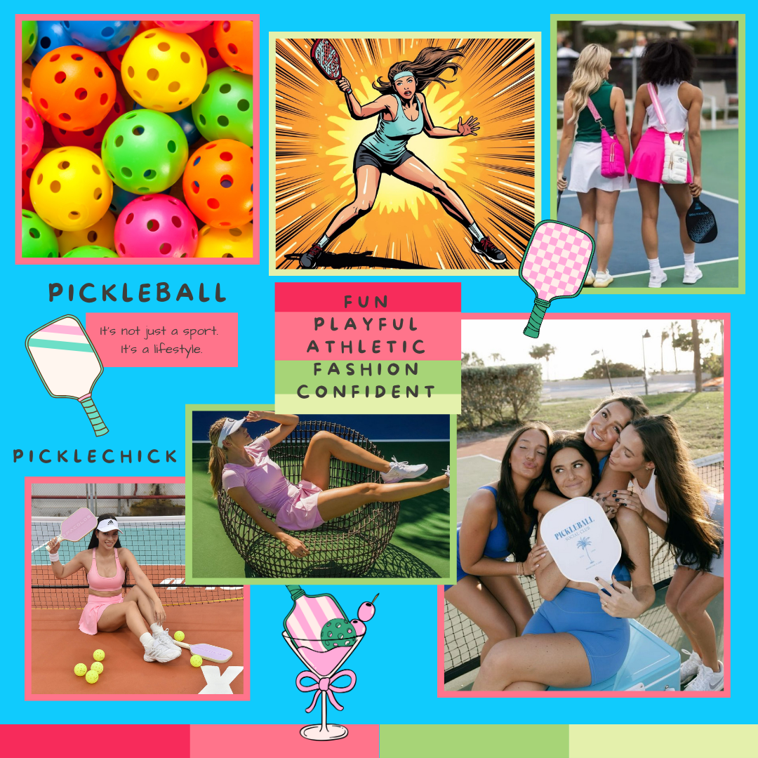
MOODBOARD
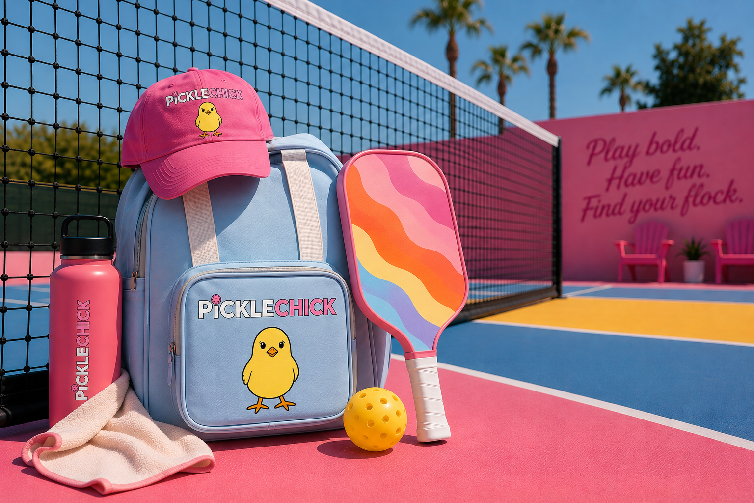
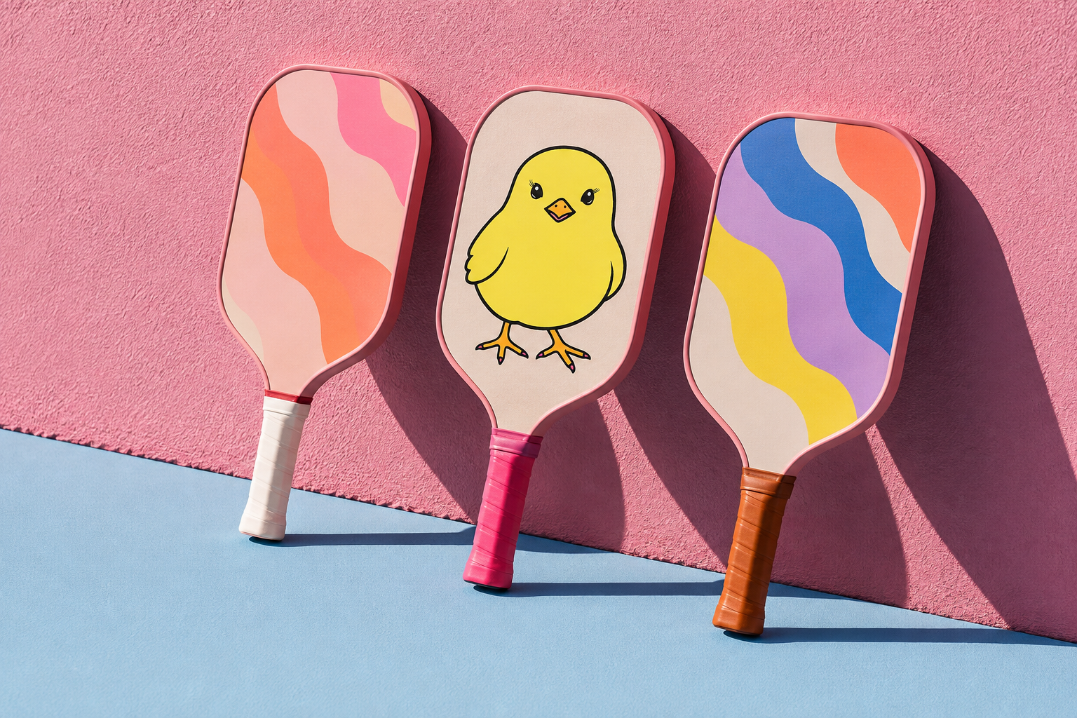
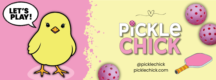
THE BRAND SYSTEM: The brand system brings strategy, identity, and content together into one cohesive experience. From naming and logo development to brand guidelines, social strategy, and cross-platform content, each element was designed to create a consistent and recognizable brand across every touchpoint.
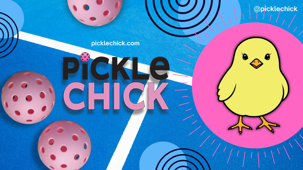
THE LOGO:



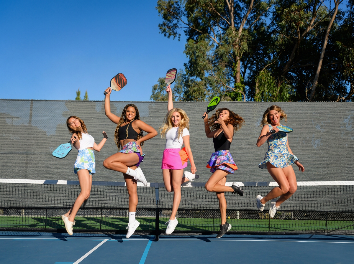
THE INSIGHT: For many women, pickleball is about more than competition. It’s a social experience, a community, and an extension of personal style. PickleChick could own that space by treating the court not simply as a place to play, but as a place to connect, express yourself, and have fun.
THE MESSAGE: PickleChick brings personality to the court with a brand built around confidence, connection, and a shared love of the game. It’s pickleball with a little more color, a lot more character, and a community that makes everyone feel part of the flock.

Play bold. Have fun. Find your flock.
Pickleball isn’t just a sport.
It’s a lifestyle.